I’ve read a lot of service pages this year, and a fair number of them were ours. Most were fine, which turns out to be a problem: a service page is often the first real conversation a stranger has with your business, and you aren’t in the room for it.
So I went looking for research on how people actually use these pages. I wanted studies with real numbers behind them, not opinions from a marketing thread. What I found reads less like a list of tips and more like a job description. A good service page does five jobs at once, and the pages I read tended to quietly skip one or two of them.
Job one: say what you do before they decide to leave
The first job is the least glamorous, and it’s the one I saw fumbled most often. Looking at data from more than 200,000 web pages, the Nielsen Norman Group concluded that the first 10 seconds of a visit are critical to whether someone stays or goes. Visitors keep leaving at a high rate for roughly another 20 seconds, and the curve only flattens out at around the half-minute mark. Jakob Nielsen’s advice from that work is hard to argue with: “To gain several minutes of user attention, you must clearly communicate your value proposition within 10 seconds.”
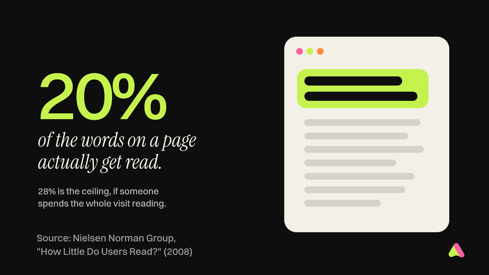
That study is from 2011, so I checked whether anything since then suggests people have grown more patient online. Nothing I came across did. An earlier estimate from the same group puts the share of words people read on an average page at about 20%, with 28% as the hopeful ceiling for someone who spends the whole visit reading.
That means the top of a service page has to work for someone who reads one line and glances at a button. I test it with three questions. What is this? Is it for someone like me? What happens if I get in touch? Compare “Empowering your financial future” with “Monthly bookkeeping for restaurants, with your numbers ready every Friday.” The first could be a bank, a yoga retreat or a fortune cookie. The second tells a restaurant owner, in one breath, that they’ve found the right page.
Job two: be the one page that answers one search
Service pages are also how many small businesses get found on Google, which brings in a second reader with very particular taste. Here the research is Google’s own rulebook. Its spam policies describe something called doorway abuse, and one of the examples will feel familiar to anyone who has bought a cheap SEO package: “multiple domain names or pages targeted at specific regions or cities that funnel users to one page.”
You’ve probably seen these. Twenty pages for “plumber in” followed by a town name, identical apart from the town. Google files that under spam, and I can’t say I blame it.
The healthier pattern is one page per service, written for the person searching for that specific thing. Google’s guide to creating helpful, people-first content includes a list of self-check questions worth taping to your monitor. Two of my favorites are “Does the content provide original information, reporting, research, or analysis?” and “Is this the sort of page you’d want to bookmark, share with a friend, or recommend?” A kitchen remodeling page that shows real kitchens, a real timeline and the problems the crew ran into on site can say yes to both. A page that announces “we are passionate about quality” can’t, however many times it says so.
This is also why the onboarding brief we send new clients asks them to name each service page one by one. Writing a list of services takes a minute. Deciding that each one deserves its own page, with its own examples and its own answers, is where a site starts doing real work in search.
Job three: prove it with specifics, not adjectives
Once someone believes they’re in the right place, they start looking for reasons to believe you. Reviews used to handle most of that. The latest Local Consumer Review Survey from BrightLocal, which asked 1,026 US consumers how they use reviews to choose local businesses, suggests reviews still count, but they carry less weight on their own than they did a few years ago.
In 2020, 79% of the people BrightLocal surveyed said they trusted online reviews as much as personal recommendations. In 2025, that figure was 42%. People also seem to be shopping around, since 74% said they use two or more review sites before deciding.
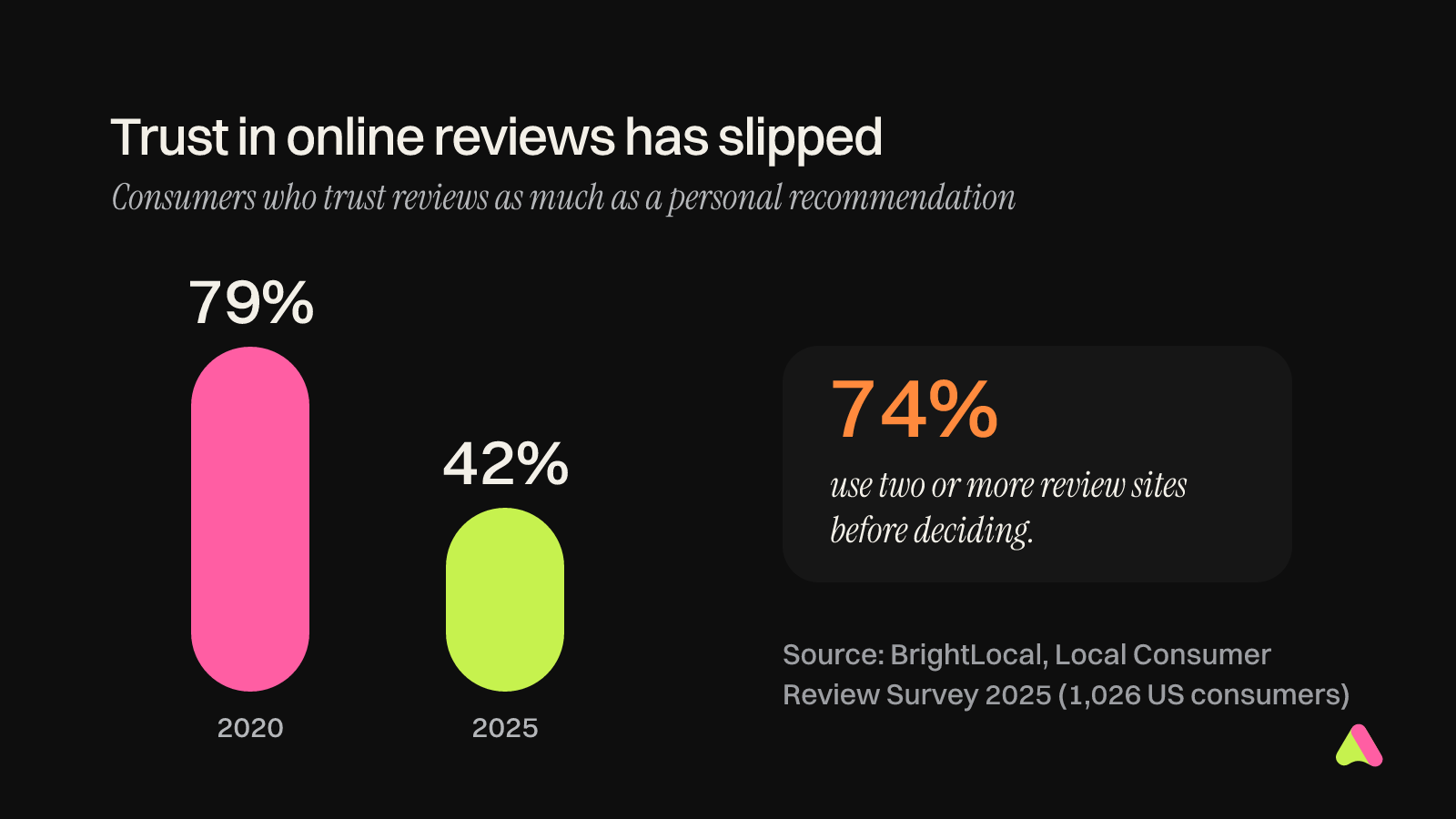
I’ll admit this surprised me at first, and then it didn’t. When every business has a row of five-star quotes, one more row tells a visitor very little. The same survey found one factor moving the other way: long, detailed reviews mattered more to people than they had the year before. Detail is the part that’s hard to fake.
So on a service page, I’d trade three generic testimonials for one specific story. Who was the client, what was going wrong, what did you do about it, and what changed afterwards, ideally with a number attached? Put that near the top, in the client’s own words if you can get them, and link to your Google reviews so people can check your homework without hunting for it.
Job four: answer the money question before anyone asks
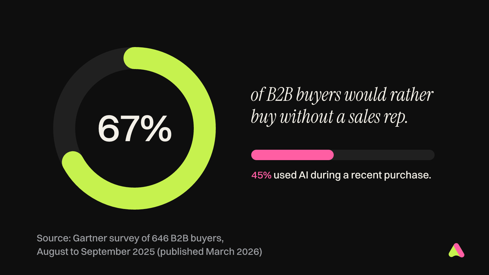
The finding that changed how I think about service pages came from Gartner. After surveying 646 business buyers in August and September 2025, it reported that 67% would prefer to buy without talking to a sales rep, and 45% said they had used AI during a recent purchase. The questions that used to come up on a discovery call are now being asked of your website, and possibly of a chatbot that has read it.
The first of those questions is usually about money. Plenty of service businesses keep prices off their sites for an understandable reason: every project is different. Jakob Nielsen looked at this exact situation years ago, and his fix still holds up. In a piece on showing prices for common scenarios, he recommended publishing “sample prices for a set of typical orders” when pricing is too custom for a price list. Early on, he explains, a buyer is building a shortlist, and your site’s goal is to “survive the pruning process.”
In that same research, one company’s price calculator was “much too complex and error prone” to give people a quick idea of cost, while another company’s plain table of sample prices was “more useful for this task.” I find that oddly comforting. You don’t need an elaborate pricing engine. You need a sentence like “Most bathroom remodels we take on land between $18,000 and $30,000, depending on fixtures and layout,” followed by a short note on what moves the number up or down.
Your process belongs in this part of the page too. A plain description of what happens after someone reaches out, how long each stage takes and what you’ll need from them answers the questions people are often too polite to ask on a first call.
Job five: make the next step feel small
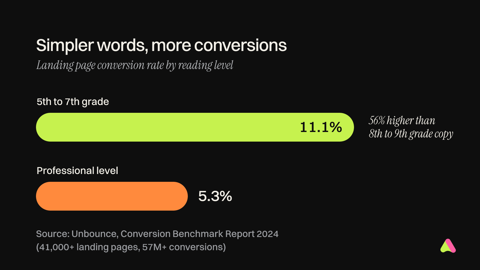
The last job is turning a reader into a conversation. Unbounce’s 2024 Conversion Benchmark Report, built on more than 41,000 landing pages and 57 million conversions, has a finding I’d happily print on every agency’s office wall. Pages written at a 5th to 7th grade reading level converted at 11.1%. That’s 56% higher than copy aimed at an 8th or 9th grade level, and more than double the 5.3% for pages pitched at a professional level.
There’s an exception worth knowing about. In financial services, Unbounce found that more complex language could help. For most service businesses, though, the lesson points toward simple words for a reader who is busy, distracted and quite possibly on a phone. In the same dataset, 83% of visits came from mobile devices, yet desktop visitors still converted 8% better on average.
Then look hard at your contact form. The website form guidelines from Nielsen Norman Group open with a rule called “Keep it short,” and the advice is to remove any field that can be found another way, collected more conveniently later, or simply dropped. For a first contact, that usually leaves a name, an email address and one open question about what they need. Budget, timeline and company size can wait for your reply.
Finally, tell people what happens when they press the button. “Get a quote” asks for trust. “Send us your project and we’ll reply within one business day” earns a little, because it answers the question a cautious buyer has before clicking: what am I signing up for?
A ten-second test you can run today
If you’d like to check your own service page, try this on your phone. Open the page, set a timer for ten seconds and look only at what fits on the screen. Then work through these questions:
- Can I tell what this business does and who it’s for?
- Is this page about one service, with details only this business could write?
- Is there a specific story or result close to the top?
- Do I have a rough idea of the cost and of what happens next?
- Is the next step one clear button with a short form behind it?
Any “no” is the job to fix first. And if you’d rather hand the fixing to someone else, this is the work we do. We write, design and build service pages in the same room, so the words and the layout end up agreeing with each other.