Takes No. 013
Apple Music’s new logo was made by sound. Here’s what a small brand can take from it
Apple Music filmed its new logo from real sound waves. Two lessons for founders: build the brand from something true, and make it work at 32 pixels.
What happened
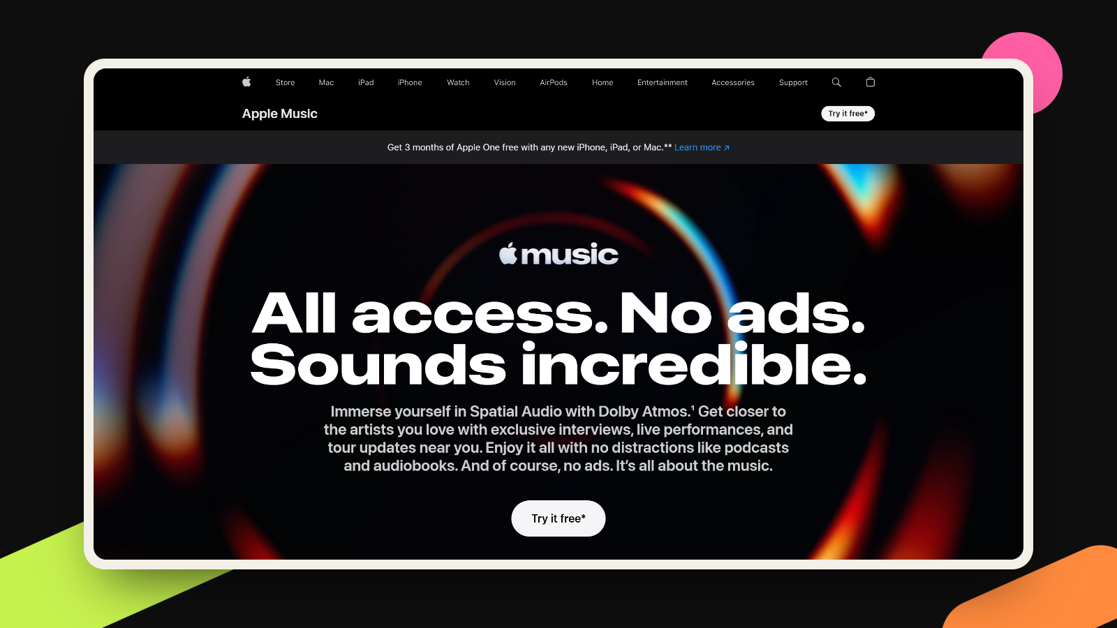
On October 21, Apple Music introduced a new brand identity with a short film called “Made by Sound”. The idea is in the title. Working with the producer Fred again.. and the sound design company NEST Acoustics, the team played music through a transducer sitting in a shallow bath of mineral oil, then filmed the ripples it made. Apple’s description says the logo was “captured entirely in camera,” and sums it up as “just music, made visible.”
Adweek reports that the agency TBWAMedia Arts Lab built the identity, which includes a wordmark set in a custom bold, lowercase version of Apple’s SF Pro typeface and a short sound-and-motion signature. MacRumors notes the new look swaps the red for black and white, first showed up in an iOS 27.2 beta on October 6, and reaches users with iOS 27.2, expected next week. Some people on social media have already criticized the plain black-and-white app icon, according to Adweek.
What it means for you
I’ve watched the film twice now, and what I like most is how little explaining it needs. A music service whose logo was literally shaped by music is a brand idea you can say in one breath. The mark comes straight out of the thing the company sells.
Small brands can borrow that principle without a star producer or a tank of mineral oil. Most businesses have a raw material that is theirs: the flour dust on a baker’s bench, a carpenter’s pencil marks, the handwritten notes a consultant makes before every workshop, the actual voice of the founder. I find a brand that grows from something real like that easier to remember, because the story and the look point at the same thing. It also gives you something to say about your logo besides “we liked the color.”
The criticism is the second lesson, and to me it’s the more useful one. The “made by sound” story lives in a behind-the-scenes film full of ripples and music. Most people will meet the brand as a small, flat icon on their phone, with no film attached. That’s where the complaints landed. A brand idea has to survive at its smallest size, in one color, without a caption. If it only works when you tell the story, it doesn’t work yet.
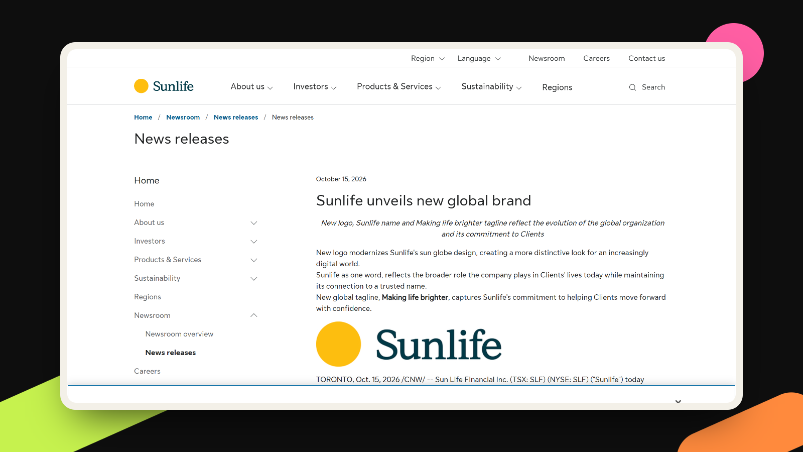
That’s a familiar problem for founders, just at a smaller scale. A logo is often approved on a big screen, in a slide deck, next to a mood board. Then it spends its life as a 32-pixel browser tab icon and a circle on a social profile. I wrote recently about Sunlife’s one-word rename, where the lesson was spelling your name the same way on every channel. This is the visual cousin of that: the brand has to look like itself everywhere, including the tiny places.
It’s also fair to give Apple some time. The new look isn’t even on most phones yet, and a mark people have seen for one day is hard to judge. The film, at least, gives it a reason to exist that a simple color swap couldn’t.
What to do this week
- Write one sentence about what your business is physically made of or how the work actually happens. Skip adjectives like “innovative.” Name materials, tools, places or sounds.
- Look for one thing in that sentence you could photograph or record yourself: your workspace, your handwriting, the sound of your product. That’s raw material for your visuals, and it belongs to you alone.
- Shrink your logo to 32 pixels wide and look at it in black and white. If it turns into a smudge, you need a simpler version for small places, like your favicon and profile photo.
- Put the story where people will find it: two sentences on your about page or a 30-second video. Apple needed a film to tell its story, because an icon can’t carry one alone. Neither can yours.
- If you change your look, wait a few weeks before reacting to the first comments. Judge it on whether people recognize you faster.
Finding that one true idea and making it work from billboard to favicon is where our branding work starts.
More takes
All takes