A service page talks to someone who already knows roughly what they want. A homepage has a harder job. It introduces the whole business to people arriving from everywhere at once, and a growing share of them know almost nothing about you except a few lines a chatbot wrote.
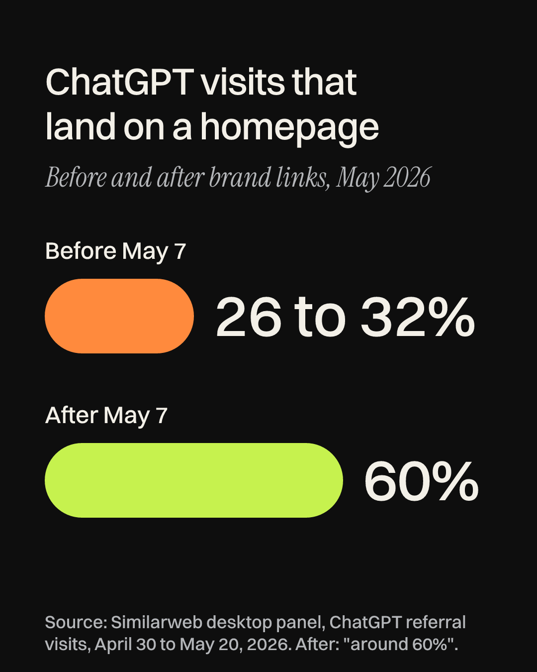
I’ve been reading the research on where homepage visitors come from, and two findings stuck with me. On May 7, ChatGPT began showing brand names as clickable links in its answers. Similarweb’s desktop panel data showed what happened next: before the change, roughly 26 to 32% of the visits ChatGPT sent to brands landed on a homepage, and afterwards that share jumped to around 60%.
The second finding comes from G2’s survey of 1,076 software buyers, run in March 2026. Half of them (51%) now start their research with an AI chatbot more often than with Google, and one in three had bought from a vendor they’d never heard of before. G2 sells tools for exactly this kind of visibility, so I read its numbers with that in mind. Still, the last one is encouraging for a startup. Strangers do buy from companies they’ve only just met, as long as the homepage makes sense to them quickly.
This guide is the process I’d follow to write a startup homepage from a blank page. It has eight steps, each with a template or a prompt you can give to AI, three real homepages taken apart, and a checklist at the end. There’s also a free file you can give to Claude, ChatGPT or Gemini to review your draft: download the homepage copy kit (.md).
If you’re writing a page for each service you offer, our guide to the five jobs of a service page covers those. This one is about the single page that has to explain everything.
Step 1: List who lands on your homepage, and what they already believe
Most founders write the homepage for one imagined visitor. In practice, several kinds of people land there: a buyer who asked ChatGPT for a tool like yours, someone who heard your name from a friend or an investor, a job candidate, and an existing customer hunting for the login button.
Write each one down with a note on what’s already in their head when they arrive. The buyer sent by a chatbot believes whatever the chatbot said about you. The person whose friend mentioned you believes whatever that friend said. Give the headline and the first screen to the stranger, the visitor with the least context. Everyone else can find what they need with one tap, so put login, careers and press in the menu, where those visitors already look.
To find out what a chatbot says about you, ask it the question your best customer would ask. Use a private or logged-out window so your own history doesn’t color the answer:
I’m a [your customer, e.g. “head of finance at a 40-person software company”]. What tools would you suggest for [the problem you solve]? For each one, tell me in one sentence what it does and who it’s best for.
If you show up, copy the sentence it wrote about you into your notes, because that’s what your visitor will compare your homepage against. If you don’t show up, the answer still tells you which competitors the visitor has in mind. Our take on ChatGPT sending people to your homepage has more on why that first comparison matters.
Step 2: Collect your customers’ words before you write your own
The best homepage lines I’ve come across were usually overheard rather than invented. Before you write anything, gather every place your customers have described their problem in their own words: sales call notes, demo request forms, support emails, reviews and direct messages. Group the phrases by the problem as they describe it, the fixes they tried before finding you, and the outcome they were hoping for.
Early-stage founders often have fewer than ten customers, and that’s enough to start. What you’re looking for is repetition, meaning the same complaint in nearly the same words from different people.
Below are notes from my customer conversations. Pull out the exact phrases customers use (don’t paraphrase) and sort them under three headings: the problem, what they tried before, and the result they wanted. After each phrase, write how many different customers said something close to it. Then list any words I use about my product that no customer used.
That last instruction tends to be the most useful. If your pitch deck says “spend orchestration” and your customers keep saying “I’m tired of chasing people for receipts”, you’ve found the gap between how you talk and how they buy. (That pair is our own illustration, not a real company.)
Step 3: Write the one sentence everything else hangs on
Before the headline, write one plain sentence that describes the business. It may never appear on the page, but every line on the page has to agree with it. Here’s the formula I use:
[Name] is a [category the visitor already understands] for [a specific person or situation] that [the one thing you do differently].
The category matters more than founders expect, because a visitor uses it to file you away: a CRM, a notepad, a bank account, an accounting firm. If you’ve built something new, borrow the nearest familiar category and let the end of the sentence carry the difference. “A new paradigm for team knowledge” makes a stranger work hard. “A shared notebook for remote engineering teams that fills itself in from your pull requests” doesn’t. (Both of those are ours, written for this guide.)
Then run the swap test. Replace your company name with your closest competitor’s. If the sentence is still true, the last part isn’t doing its job yet, so keep rewriting until the sentence only fits you.
Step 4: Turn the sentence into a headline and a subhead
The headline and the line under it, called the subhead, are the two lines a visitor is most likely to read. On November 7, 2026, I looked at the first screens of seven startup homepages on a phone-sized screen, and the clearest ones used one of two patterns.
Pattern 1: the headline does the explaining
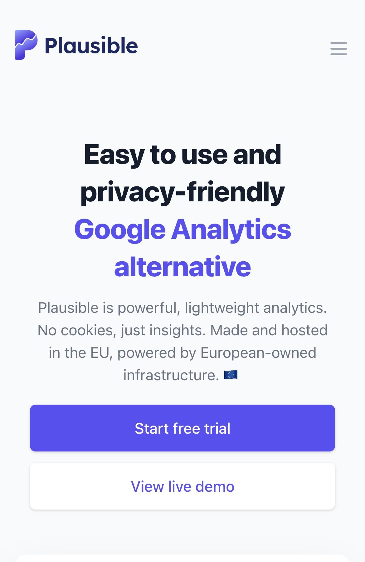
Plausible, a web analytics company, puts its category straight into the headline: an “easy to use and privacy-friendly Google Analytics alternative.” Naming a product people already know saves a lot of explaining. Anyone who has used Google Analytics instantly knows what Plausible replaces, and “privacy-friendly” tells them why they might switch. The subhead backs the difference up with “No cookies,” and the page title repeats the same idea, which is the text that shows up in a browser tab.
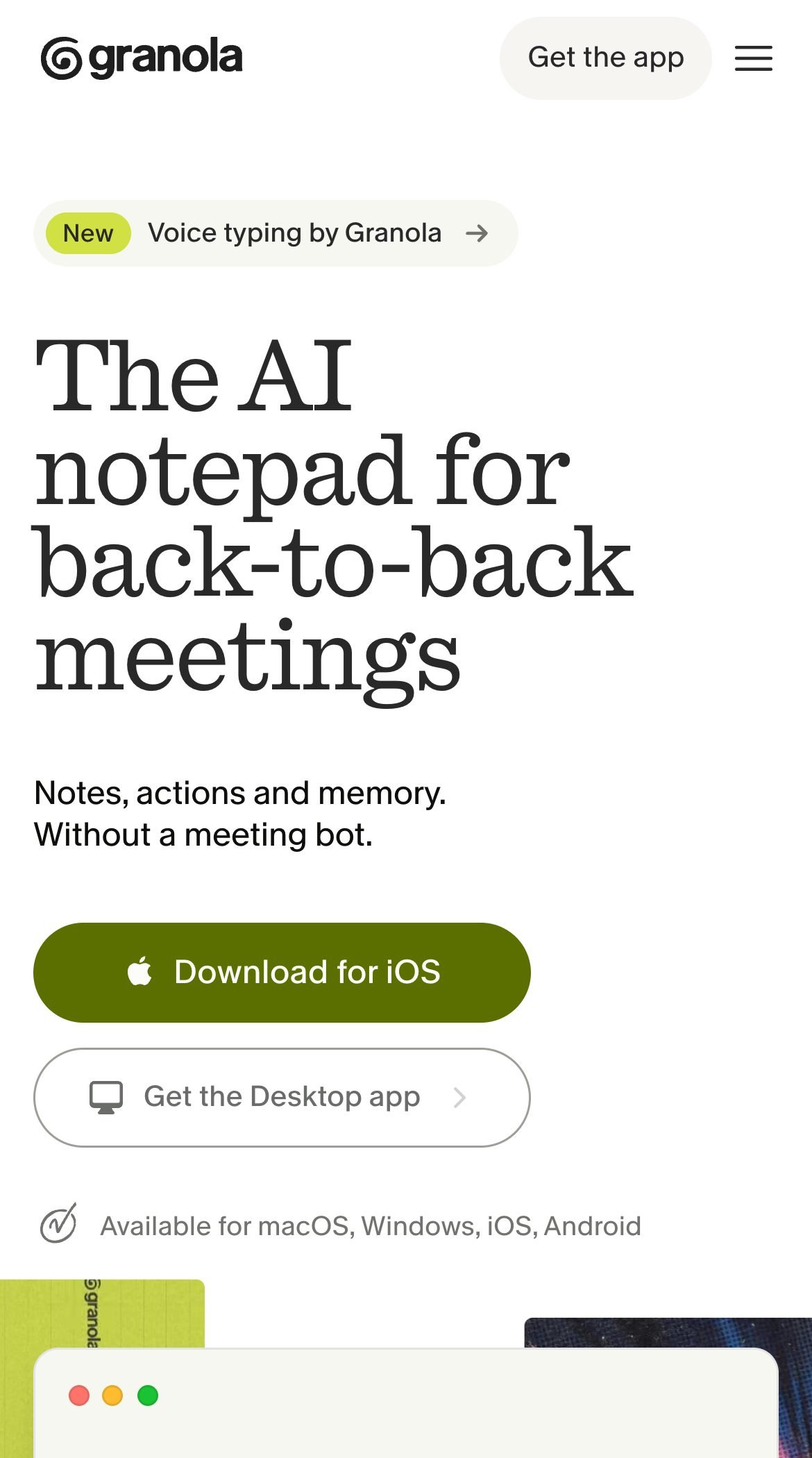
Granola uses the same pattern with a twist. Its headline, “The AI notepad for back-to-back meetings,” names a category (a notepad) and a situation its buyer lives in (back-to-back meetings). A situation is a sharper target than a job title, since people in very different roles recognize a calendar with no gaps. The subhead then answers a likely objection in four words: “Without a meeting bot.” When I loaded the page with an iPhone browser setting, the main button read “Download for iOS,” so even the button matched the device in the visitor’s hand.
Pattern 2: a short line, then a plain subhead
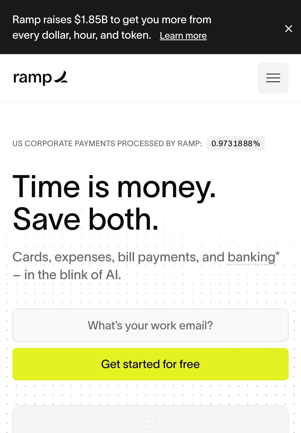
Ramp, a finance software company, leads with a line that reads like a slogan: “Time is money. Save both.” On its own, it could belong to almost any business. The subhead rescues it by saying what Ramp sells: “Cards, expenses, bill payments, and banking.” Above the headline sits a live counter of the share of US corporate payments Ramp processes, which turns a proof point into part of the design. And Ramp’s title tag, “Spend Management, Corporate Cards & Accounts Payable Solutions,” does the plain explaining the headline skips.
Pattern 2 works when the subhead could stand alone as your one-sentence description. It’s also riskier for a young company. The banner on Ramp’s page announces a $1.85 billion raise, and plenty of its visitors already know the name. A startup nobody has heard of usually gets more from pattern 1.
Write at least ten versions before you pick one. These three templates cover most of what I saw:
- The [category] for [a specific person or situation].
- The [well-known product] alternative for [who], without [the thing they dislike about it].
- [A plain outcome] for [who], with a subhead that lists what you sell in three or four nouns.
With AI, give it your sentence and your customers’ words, and make it check its own work:
Here is my one-sentence description: [sentence]. Here are my customers’ own phrases: [paste from step 2]. Using the three templates below, write 10 homepage headlines of 8 words or fewer, each with a subhead of up to 20 words. Use my customers’ words where you can. Don’t use: solution, platform, empower, transform, next-generation, innovative. Mark every headline that would still be true for a competitor.
Step 5: Put proof on the first screen
A stranger who just learned your name is quietly checking whether you’re real. The first screen is where a little proof does the most good, and for a startup it rarely looks like a wall of famous logos. Use the strongest true thing you have. In rough order, that’s a named customer and what changed for them, a number you can stand behind (customers, teams, hours or money saved), a short quote from a real user with their name and role, or, when the company is too young for any of those, the founder background that makes you credible on this exact problem.
That last one is underrated. For the right buyer, a line like “built by two former hospital pharmacists” can say more than “trusted by teams worldwide.” (Again, that’s our example.) Keep the proof to one line or one row near the headline, and save the details for further down the page.
Step 6: Order the rest of the page by the visitor’s questions
Below the first screen, each section should answer the next question a stranger is likely to have, in the order they’d ask it. It helps to remember where most of those strangers are reading. Contentsquare’s 2026 Digital Experience Benchmark, built on 99 billion sessions across 6,500 websites, found that mobile brings 70% of website traffic. The average session lasted 2 minutes 20 seconds on mobile, against 4 minutes 46 seconds on desktop, and visitors were scrolling less than a year earlier.
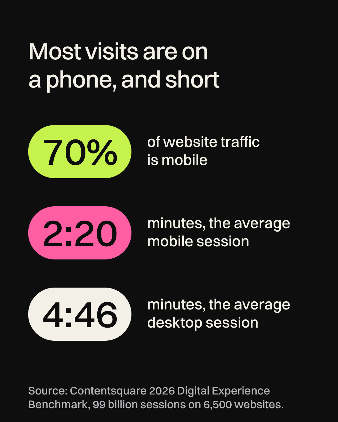
On a phone, that calls for short sections that each make sense alone, since many visitors will only read two or three of them. Here’s the order I’d start from:
- First screen: headline, subhead, one line of proof and one button.
- The problem: two or three sentences in your customers’ words from step 2.
- How it works: three steps, from signing up to the first result.
- Proof in detail: one named customer, with their before and after.
- Who it’s for, and who it isn’t for: this saves a mismatched visitor time and tells the right one they’re in the right place.
- Price, or how to start: a starting price or a free plan if you have one.
- Questions: the three objections you hear most on sales calls, answered plainly.
- A last call to action: the same button as the top of the page.
Write each section heading as a statement, so someone who only skims the headings still gets the story. “How it works” is fine, but “Your receipts sort themselves” tells the reader something.
Step 7: Choose one main action, and name it plainly
Give the page one main button and repeat it, rather than four buttons that compete with each other. Name it after what happens next: “Start free trial” (Plausible), “Download for iOS” (Granola) and “Get started for free” (Ramp) each tell a cautious visitor what they’re signing up for.
Then add one quieter option for people who aren’t ready. Plausible’s second button is “View live demo,” which lets a visitor see the product without giving an email address. If you sell something that needs a call, a short video or a page of sample prices can do the same job for people who’d rather look before they talk.
Step 8: Test it before it goes live
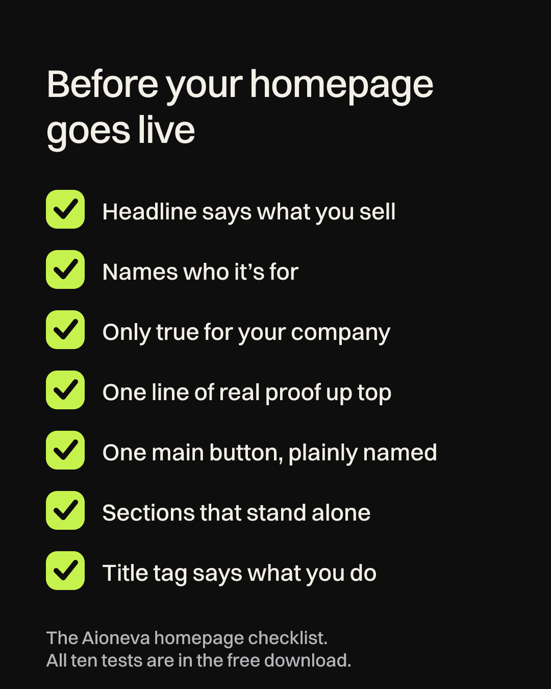
You’re too close to your own product to judge whether the homepage is clear, and so is your team. Three quick tests help.
The five-second test. Show the first screen on a phone to three to five people who don’t know your company, for five seconds. Then ask what the company does, who it’s for and what they’d tap. If their answers don’t match your step 3 sentence, change the headline and subhead, not the people you asked.
The fresh-chat test. Copy all the text from your homepage into a new chat in Claude, ChatGPT or Gemini, and upload the homepage copy kit with it. The file asks the AI to describe your business in one sentence from the page alone, then checks the copy against ten pass-or-fail rules. Compare its sentence with yours. Use a new chat, or a different AI from the one that helped you write. When we tested a similar file on a YouTube script, the chat that wrote the script passed its own work, and a fresh chat found four problems (the full story is in our faceless script guide).
The title check. Google’s documentation on site names says the name it shows beside your search results takes into account content from your home page, including its title element and headings. Ramp is a good reminder of why that matters: its headline is a slogan, and its page title carries the plain description. Make sure yours includes your name and what you do.
Finally, put a reminder in your calendar three months out to repeat step 1. What chatbots say about you will change as you grow, and your homepage should keep up with it.
Writing a homepage is mostly deciding what to leave out, which is surprisingly hard to do for your own company. If you’d like a hand, it’s the kind of website work we do, from the words to a site built on WordPress or fully custom-coded. And once the homepage works, your founder bio is worth tightening too, so here’s our guide with founder bio examples.